
Last updated on March 9th, 2026
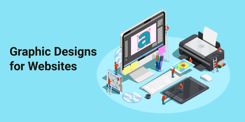
Ever wondered why some blogs quietly talk while others confidently convince in visual language? The secret is graphic design. This is a thoughtful and deliberate design strategy.
Graphics guide the eye and pause the scroll. They give meaning to words that might otherwise float away. A skilled graphic web designer does more than decorate a page. They shape attention, reinforce trust, and create rhythm across websites and blog posts.
Graphics matter more than ever for building a brand-new website or refreshing an old blog that feels jaded. Many blogs fail not because the writing is weak, but because the visuals appear confused. There is no clear identity, no visual flow, and no harmony between content and design.
This article explains how graphics quietly improve your website or blog post without clutter and without confusion.
Table of Contents
Choose the Right Image Size for Your Website
Avoid Clutter With Text Overlays
Be Creative With Background Images
Graphic and Web Design Tips for Modern Websites
Best Platforms to Outsource Professional Graphic Designers
How to Hire a Freelance Graphic Designer for Branding Projects
What to Look for When Outsourcing a Graphic Designer Online
How to Evaluate Portfolios When Outsourcing Graphic Design Work
How to Ensure Quality When Outsourcing Graphic Design Projects
Outsource Professional Graphic Designer With Us!
Emerging AI Solutions for Business Trends
Frequently Asked Questions (FAQ)
Choose the Right Image Size for Your Website
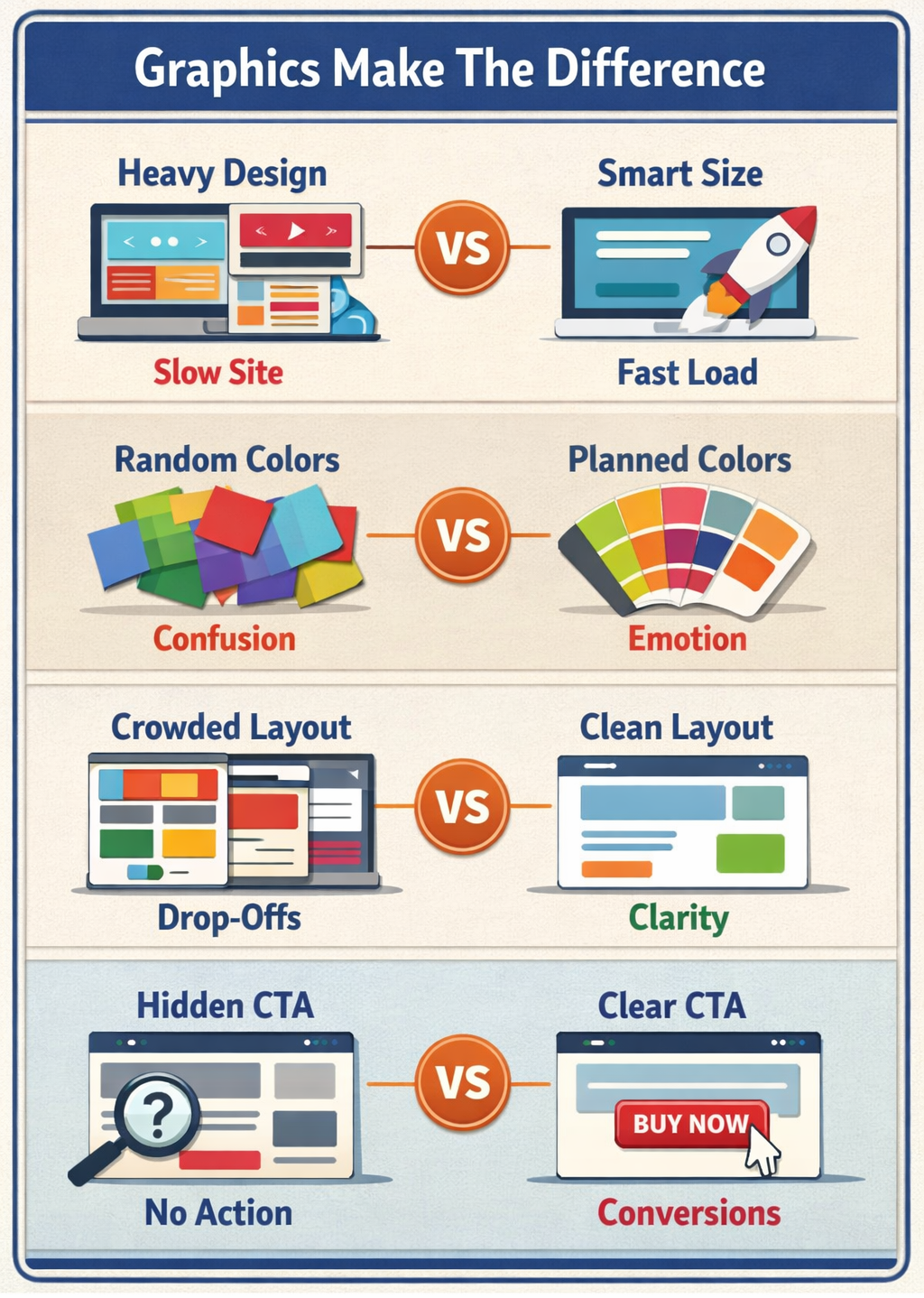
Image size is a quiet power. Too small, and it blurs your authority. Too large, and your website crawls like a tired snail.
Choosing the right size keeps images sharp, fast, and friendly across devices. A heavy graphics website without optimization may look beautiful, but it frustrates users and search engines alike.
Here’s how a professional graphic web designer usually approaches it:
1. Start with Small Images
Smaller images reduce load time and improve performance. Most websites only need a few sizes. Starting small avoids wasted space and unnecessary data weight.
2. Pick Standard Sizes First
Once a base size is chosen, designers select one or two larger options. This creates flexibility without chaos. Expansion can happen later, slowly and thoughtfully.
3. Think Responsively
Responsive design means images adapt. Widths and heights should scale based on screen size, orientation, and resolution. Desktop rules differ from mobile logic.
4. Check Mobile Viewport Width and Height
Even responsive images need boundaries. Containers must respect viewport limits, or images may stretch, squash, or lose their calm balance.
5. Avoid Large Image Files
Large files slow everything down. Platforms like WordPress resize automatically, but not always perfectly. Double-check sizes before uploading, always.

Avoid Clutter With Text Overlays
Text overlays can elevate design.
When used with restraint, overlays guide attention. When abused, they confuse and overwhelm.
1. Use Only One Type of Text When Needed
If one message is enough, one text style is enough. Prices, labels, or short cues should remain simple and direct.
2. Don’t Create Too Many Different Types of Text
Too many fonts or styles compete for attention. Visitors won’t know where to look. Consistency calms the eye.
3. Limit The Number of Times That You Reposition Objects
Constant movement disrupts flow. A stable layout improves readability and boosts conversion. Stillness can be powerful.
Be Creative With Background Images
Backgrounds are silent storytellers. They shape mood before words are read.
1. Use A Colorful Background Image
Color adds emotion. It can energize or soothe. Choose wisely.
2. Pick A Simple Background
Simple does not mean dull. It means intentional. Let the content tell its story.
3. Add A Gradient Effect
Gradients add depth without distraction. They are gentle transitions, not loud statements.
4. Experiment With Different Textures
Texture adds dimension. You can use subtle grain and soft patterns for quiet interest.
5. Focus On One Element At A Time
Crowded pages exhaust visitors. Focus creates clarity.
6. Incorporate More Than One Photo Background
Used sparingly, multiple backgrounds add rhythm across sections.
7. Include A Video Background
When optimized properly, video backgrounds can explain, persuade, and connect.
Include Call To Actions
A call to action is not a button. It’s a decision waiting to happen.
1. Match Design With Content
CTAs should feel like they belong. Try to use the same colors and the same tone rather than surprises.
2. Use Clear Buttons And Icons
Contrast matters, and size matters. Icons help users decide faster. They encourage less thinking and more doing.
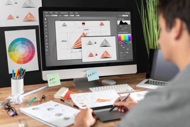
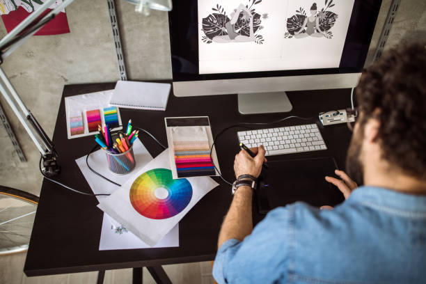
Graphic and Web Design Tips for Modern Websites
Modern websites demand balance. Beauty alone is not enough. Speed and structure matters too.
A graphic and web design strategy must consider performance alongside creativity. A heavy graphics website needs compression, smart loading, and a thoughtful layout to avoid delays.
Explore graphic design portfolio websites and the best graphic design websites to see how professionals blend usability with visual storytelling. These platforms reveal trends, spacing techniques, and layout discipline worth learning from.
Strong design builds credibility quietly and consistently.
Best Platforms To Outsource Professional Graphic Designers
Did you know that about 43% of graphic design projects globally are now performed remotely, and that share is expected to grow as remote collaboration becomes more common.
Outsourcing opens doors to global talent. Some trusted platforms include curated hiring agencies, freelance marketplaces, and remote staffing firms specializing in creative roles.
Agencies often provide better vetting, faster onboarding, and long-term reliability compared to random freelance searches.
How To Hire A Freelance Graphic Designer For Branding Projects
Start with clarity. Define your brand voice. Share references and set expectations early.
Look for designers experienced in branding. Work on visuals, systems, consistency, and storytelling.
What To Look For When Outsourcing A Graphic Designer Online
- Clear communication
- Proven industry experience
- Consistent portfolio quality
- Understanding of brand guidelines
Skill matters, but reliability matters more.
How To Evaluate Portfolios When Outsourcing Graphic Design Work
Look beyond beauty. Examine structure, consistency, and problem-solving. Strong portfolios explain decisions. Weak ones only display images.
How To Ensure Quality When Outsourcing Graphic Design Projects
Set milestones. Request drafts and provide feedback early. Maintain documentation.
Quality grows through collaboration, not control.
Emerging AI Solutions for Business Trends
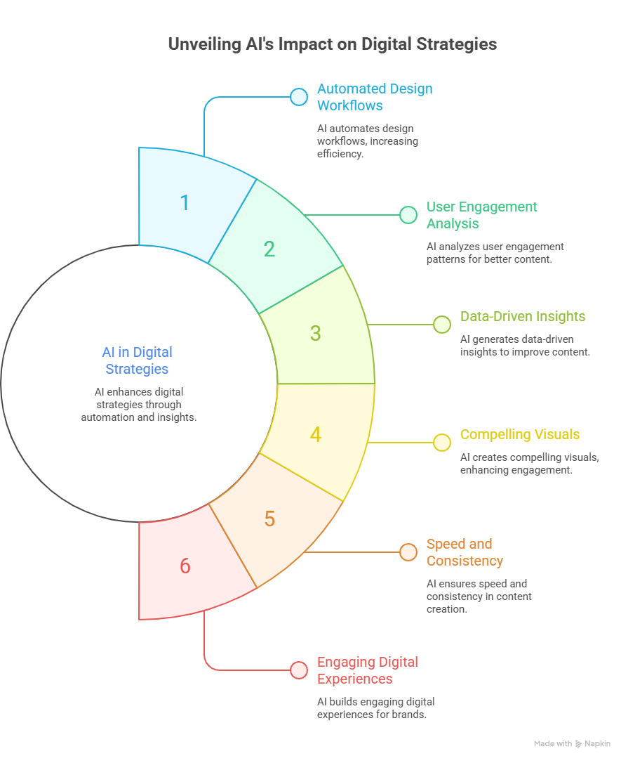
As visual storytelling becomes essential for modern websites and blogs, businesses are also exploring intelligent technologies to strengthen their digital strategies. Integrating AI solutions for business can help organizations automate design workflows, analyze user engagement patterns, and generate data-driven insights that improve content performance. From AI-powered image generation to intelligent content optimization, these tools enable teams to create more compelling visuals while maintaining speed and consistency. When combined with skilled designers and thoughtful graphic strategies, AI-driven capabilities help brands build engaging digital experiences that capture attention and drive measurable results.
Frequently Asked Questions (FAQ)
1. Why are graphics important for a website or blog?
Graphics attract attention, improve readability, and build trust visually.
2. What image sizes should I use for my website?
Use optimized, responsive sizes that balance clarity and performance.
3. How do I avoid clutter with text overlays?
Limit fonts, styles, and repositioning to maintain visual focus.
4. Can videos be used as backgrounds?
Yes, when optimized, video backgrounds enhance engagement.
5. How can I outsource graphic design work effectively?
Choose reliable platforms, evaluate portfolios carefully, and set clear expectations.
Conclusion
Graphics are not decoration, but they are communication tools. When used thoughtfully, they transform websites and blog posts into experiences that feel intentional, gentle, and persuasive.
Recruit Ninjas helps businesses hire skilled remote graphic designers without friction. From branding to full-scale graphic and web design, we connect you with vetted professionals who understand performance, creativity, and consistency. Build visuals that quietly work harder for your brand.
Partner with Recruit Ninjas today.
Suggested Reads
https://www.recruitninjas.com/blog/expert-predictions-what-will-graphic-design-look-like-in-the-next-decade/ – Future-focused insights into evolving graphic design trends
https://www.recruitninjas.com/blog/offshore-graphic-design-teams-fashion-industry/ – How global designers support fast-moving fashion brands
https://www.recruitninjas.com/blog/can-the-pomodoro-technique-unlock-your-most-focused-work-sessions-ever/ – Simple productivity method for creative professionals
https://www.recruitninjas.com/blog/explore-the-world-of-offshore-graphic-design-finding-the-best-talent-abroad/ – Finding skilled graphic designers across global markets

Kimberly Morrison
Kimberly Morrison has been the Director of Client Relations at VGROW since 2019. She builds strong customer relationships, drives client retention, and oversees team productivity. Kimberly's approach to customer engagement is key to VGROW's aim of streamlining business processes through virtual assistance services.